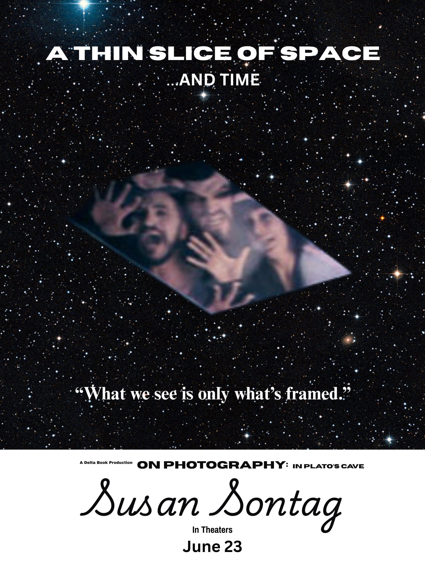
For my movie poster, I chose a phrase that Susan Sontag used in her book, On Photography. Specifically, she spoke of a photograph being "a thin slice of space, as well as time" (Sontag 22). This phrase stood out to me because of how often images are used in media to tell a story, sell a product or sway an audience with provocative photographs that often do not tell the whole story, but only a slice of it. Sontag believes photographs are partial representations that preserve a moment and a view, often portrayed in a highly selective, constructed way. She refers to the French term faits divers to describe how photographs, like brief sensational news items, isolate fragments of reality. A photograph crops the visible world, carving out one framed portion while excluding everything else. What falls inside the frame is "the world," while what is outside disappears. Therefore, each image offers a narrow view of both place and time rather than a seamless, contextual whole. Viewers of the image believe they are seeing the entire "picture," when in fact they are seeing a carefully framed portion of it. What we see, and therefore feel, is only what is framed. We glimpse reality, but only in fragments.
When it came to capturing my phrase on a movie poster, I began by designing it with the look of a classic instant Polaroid photo. with the image on top and room for writing details below. As far as imagery, what came to mind was a distinct scene from Superman: The Movie (Donner, 1978) where prisoners who had been found guilty of treason, float in a suspended state in the Phantom Zone. All you see are their framed faces as they remain stuck in time and space. The rest of their stories are unknown and will remain that way. In an effort to gain attention for the poster’s title, I chose to use a larger size Horizon sans serif font to give the first line a bold cinematic feel. I followed the second line with a smaller Canva sans serif font that visually appears like an echo. Both lines of the title were done in white and centered for symmetry. The tagline that appears below the centered image is done in a Times New Roman serif font that displays an elegant quality that stands out as something important. The final credits to the book are printed all in black, on what appears to be the white bottom portion of a Polaroid photo, typically reserved for captions or notes. In this case, I have centered and enlarged the name of Susan Sontag’s book, On Photography and used Horizon sans serif for a prominent look, as well as the clean and concise Archivo Black and Narrow fonts for other details. Finally, I centered Susan Sontag’s name in the Playwrite US Trad handwritten font to express a warm, expressive style akin to how most Polaroid photos are marked up on the bottom portion of a photo.